A look at cyclical price peaks in the merino market
Current merino prices are mesmerising. If you doubt this, take a look at prices being paid for stains, cardings and fine crossbred wool which can be used for blending purposes let alone the price levels for the broader merino categories. This article looks at how the current merino cycle fits with past price cycles.
Wool production has changed a lot in the past half century as has the inflation adjusted value of the currency. To accommodate these effects this article uses the average merino micron price series adjusted for inflation. This focusses the price on the core merino price, and brings past price levels up to current price levels in terms of inflation.
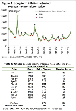
Figure 1 shows the deflated average merino micron price from the mid-1960s through to last week, with cyclical peaks (black squares) and cyclical low (red circles) shown. The 1973 and 1988 price cycle peaks stand out in Figure 1. In inflation adjusted terms price was stable from the mid-1970s to the mid-1980s. After the collapse of the Reserve Price Scheme the inflation adjusted price stepped down and traded in a fairly well defined range through to 2016, after which is has traded to higher levels.
Table 1 is a summary of the cyclical peaks shown in Figure 1. It shows the month of peak price, the monthly average price, the size of the price change from the previous cyclical low (in the case of 1973 3.00 means the price rose by 300%) and the time taken in months to go from the previous cyclical low to the cyclical peak. The median change in price from low to peak is 0.72, however there are a few small cycles from the peak RPS decade from the mid-1970s onwards. From 1988 onwards the median cyclical rise is 0.97 (a 97% rise in price or near doubling of price) taking a little of 2 years at 25 months.
So, where does that leave the current price cycle? In price terms the current market (August 2018) has risen by 0.99 from the last cyclical low, so it is around median level for rising cycles from the mid-1980s onwards. By this price rise standard the current cycle is nothing extraordinary, which is an interesting observation.
Strictly speaking the current rising cycle has been running for 71 months but in practical terms the cycle started to lift in late 2014 so the cycle is around 47 months old in Australian dollar terms. Either way the cycle is ancient by the standards of past cycles.
This analysis is designed to provide a base rate or base pattern for a rising price cycle in the merino greasy wool market. Each cycle will vary in the conditions applicable to the cycle. For example the 1973 cycle had a general commodity boom going on, the 2002-3 cycle was a classic post stockpile boom and the 2011 cycle was really a cotton boom. The current cycle has two observable features. Firstly the starting price was relatively high and secondly supply is low and about to be limited further by dry conditions. At this stage the price rise is what we would expect from a standard cycle.
Key points:
- The standard rising price cycle for the average merino micron price since the mid-1980s has resulted in prices doubling from the previous cyclical low.
- These rising price cycles have generally taken around 2 years to play out.
- This is the base pattern for rising price cycles.
- In comparison the current cycle has risen by 99% from the previous cycle low, close to median , over nearly 4 years (twice as long as normal).
What does this mean?
Each price cycle will have its own peculiarities, so the median rising price cycle is only a guide to the standard pattern we can expect. At this stage the pattern tells us that price, which is high as it usually is in the upper section of a rising price cycle, has risen by a normal margin, although the time taken has been much longer than normal. It is not a super cycle.

